
Iconography
COVALIDA icons are a single, coherent family. Every icon speaks the same visual language: a Deep Petrol circle carrying a white line-symbol at a consistent stroke weight with rounded caps and joins. Because the grammar is fixed, any new icon slots into the set without a redraw — the system does the work, not the individual drawing.
One grammar, many symbols
If you can describe an icon in one sentence — "a white line-symbol inside a Deep Petrol circle" — it belongs. If it needs an explanation, a second color, or a filled shape to read, it does not.
The five business-area icons
These are the working icons of the five pillars. Each is a minimal line-symbol chosen for instant recognition of its domain — not a literal illustration.

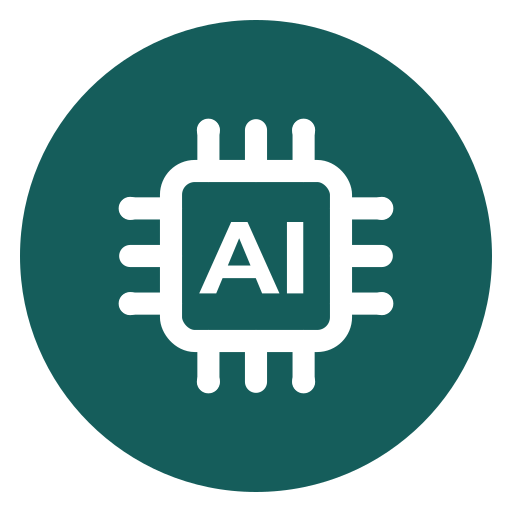
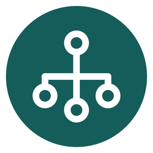


| Icon | Pillar | Metaphor | Represents |
|---|---|---|---|
| Gear | Covalida Core | Gear | Company processes, the integrated management system |
| AI chip | Covalida Tech & Trust | AI chip | Digital resilience, information security, AI governance |
| Network | Covalida Traceability | Connected nodes | Supply chains, due diligence, provenance |
| Circular arrows | Covalida Circularity | Loop | Product and material lifecycle, circular economy |
| Graduation cap | Covalida Training | Cap | Enablement, person certification, the Academy |
The shared grammar
Every icon is built from the same five ingredients. Hold to them and the family stays coherent.
1. The circle
A solid disc filled with Deep Petrol #155D5B. This is the constant container — the same circle across all icons. It gives the family its rhythm and makes an icon read as "COVALIDA" before the symbol inside it is even parsed.
Do not use a gradient in the circle, do not outline it, and do not swap its color per pillar. The pillars are distinguished by their symbol, never by a different circle color.
2. The white symbol
The line-symbol sits centered inside the circle, drawn in white #FFFFFF only. White gives the maximum, WCAG-safe contrast against Deep Petrol (well above 7:1 · AAA) and keeps the whole set legible down to small sizes.
3. Stroke weight
One consistent stroke weight across the family. On the standard 48 px icon the symbol stroke is 2.5 px; scale it proportionally with the icon (roughly 5% of the icon's width) so the visual weight stays even at every size.
Icon size    Symbol stroke
24 px        1.25 px
32 px        1.75 px
48 px        2.5 px   (reference)
64 px        3.25 px
4. Rounded caps and joins
Every open end uses a round cap; every corner uses a round join. This is what makes the set feel calm and premium rather than sharp or technical. No square or butt caps, no mitered corners.
.covalida-icon-symbol {
  fill: none;
  stroke: #ffffff;
  stroke-width: 2.5;      /* at 48px; scale ~5% of icon width */
  stroke-linecap: round;
  stroke-linejoin: round;
}
5. The grid and padding
Draw on a 24-unit grid with the symbol living inside a centered live area of roughly 60–70% of the circle's diameter. The clear ring of Deep Petrol between the symbol and the circle edge is part of the design — never let a symbol touch or break the circle.
Geometric and minimal
Build symbols from clean geometry — circles, arcs, straight lines, even chamfers that echo the faceted Core-Shield. Two to four strokes is the target. If a symbol needs a dense tangle of lines to be recognized, simplify the metaphor instead.
The symbol vs. the pillar icons
Two things in the system look related but are not interchangeable.
- The Core-Shield symbol is the brand mark — the faceted "C" shield with a teal diagonal gradient and an inner mini-shield. It stands for COVALIDA as a whole. It carries the gradient; it is never reduced to a white-line-in-a-circle. See Logo & Symbol.
- The pillar icons are the functional icon set — flat, single-color, white-on-Deep-Petrol. They label the five business areas inside layouts, navigation, cards and diagrams.
Don't blur the two roles
Never put the Core-Shield inside a Deep Petrol circle to "match" the pillar icons, and never fill a pillar icon with the signature gradient to "promote" it to a brand mark. Each role has one correct form.
Sizing and spacing in layout
- Minimum size: 24 px. Below that the rounded strokes muddy — use a label instead of an icon.
- Comfortable UI size: 40–48 px for cards and feature rows.
- Clear space: keep free space of at least 25% of the icon's diameter on all sides. Don't crowd icons against text or against each other.
- Alignment: align icons to the optical center of adjacent text, not the raw bounding box.
- Pairing with color: the Deep Petrol circle is designed to sit on light surfaces — white, Light Mint #CDE9E6, or the teal-50 tint. On a dark surface, keep the same icon; the Deep Petrol circle still reads against near-black.
Do and Don't
Keep it flat
White line-symbol, Deep Petrol circle, consistent stroke, rounded caps. One symbol per icon.
Scale as a whole
Resize the SVG so the circle and symbol grow together. Stroke stays ~5% of icon width.
Match the metaphor
Extend the set only with symbols as simple and recognizable as the original five.
- Don't recolor the circle per pillar or apply the signature gradient to a pillar icon.
- Don't add a second color, a drop shadow, a bevel or a glow to the symbol.
- Don't use a filled/solid glyph where the system calls for a line-symbol — keep
fill:noneon the stroke. - Don't switch cap or join style; square caps break the family instantly.
- Don't rotate, skew, or stretch an icon non-uniformly.
- Don't place the symbol so it touches or overlaps the circle edge.
- Don't rebuild an icon by hand — always start from the source SVG.
Extending the set
When a new business area or feature genuinely needs its own icon:
- Reuse the existing Deep Petrol circle unchanged.
- Sketch the metaphor as two to four strokes on the 24-unit grid.
- Apply the shared stroke spec: white, ~5% width, round caps and joins.
- Test at 24 px — if it survives, it is simple enough.
- Place it beside the existing five for a family check before shipping.
Grab the source files from Downloads, the color values from the Color System, and the visual direction for photography from Imagery.