
Construction & Clear Space
The logo is drawn on a deliberate geometric grid. You never need to rebuild it — always place the supplied vector — but understanding the construction is what lets you give the mark the space and scale it needs to feel calm and premium.
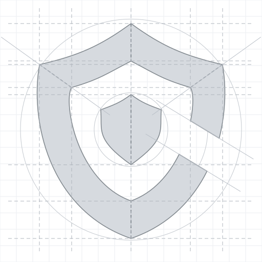
The construction sheet above is available as SVG on the Downloads page. It shows the faceted geometry of the Core-Shield and the proportions that define it.
The unit "x"
All spacing and minimum-size rules are expressed in a single relative unit, x, so they scale with the logo.
Define x once, apply everywhere
x = the height of the symbol (the Core-Shield) at the size you are placing the logo. Everything below is measured in multiples of that x. Because x is relative, the rules hold whether the logo is 32 px tall or fills a banner.
Clear space
Keep a protected zone around the logo, free of text, other logos, icons, rules and busy imagery.
- Minimum clear space = 0.5x on all sides — that is, half the symbol height around the entire lockup (top, bottom, left, right).
- Measure from the outermost edge of the mark: the symbol on one side, the end of the wordmark on the other.
- More is better. 0.5x is the floor, not the target. Whitespace is a core brand asset — when the layout allows, give the logo 1x or more and let it breathe.
┌───────────────────────────────────────┐
│            ↕ 0.5x clear space          │
│   ┌───┐                                │
│ ← │ ▲ │  C O V A L I D A            →  │   x = symbol height
│   └───┘                                │   margin = 0.5x on every side
│            ↕ 0.5x clear space          │
└───────────────────────────────────────┘
The same 0.5x rule applies to the vertical lockup and to the standalone symbol — measure x as the symbol height in each case.
Minimum sizes
Below these thresholds the faceted geometry and the wordmark stop reading cleanly. Never go smaller.
| Element | Minimum size (digital) | Notes |
|---|---|---|
| Symbol (gradient or flat) | 24 px tall / wide | Below this the inner shield muddies; use flat mono for the very smallest favicons |
| Horizontal logo | 120 px wide or 32 px tall | Whichever limit you hit first — keep both satisfied |
| Vertical logo | scale so the wordmark stays legible | The stacked wordmark is the limiting factor; don't let it fall below the horizontal's cap-height legibility |
At small sizes, simplify
For favicons and other tiny marks, prefer the flat mono symbol over the gradient. A gradient compressed into 16–24 px can band or turn to mud; the single-color shape stays sharp.
Placement guidance
- Alignment. Align the logo to the layout's existing margin or grid — the same edge as your body text or header content. Don't float it at an arbitrary offset.
- Corners and headers. Top-left is the natural home for the horizontal logo in a header. Keep at least the 0.5x clear space between the logo and the container edge; more if the header is tall.
- Optical centering. When centering the vertical logo, trust your eye over the math — the symbol's visual weight sits slightly high, so a mathematically centered lockup can look low. Nudge it up a touch if needed.
- One logo per view. A single, well-spaced mark reads as more confident than a repeated or oversized one. Resist the urge to scale the logo up to fill space — use whitespace instead.
- Sit it on calm ground. The clear-space zone should fall on a quiet background. If the surface behind it is busy or low-contrast, place the logo on a solid panel first (see Misuse).
Quick checklist
- [ ] Placed from the master SVG (or a high-res PNG), never redrawn
- [ ] At least 0.5x clear space on all four sides
- [ ] Symbol ≥ 24 px; horizontal logo ≥ 120 px wide / 32 px tall
- [ ] Correct version for the background (positive on light/mint, dark on dark)
- [ ] Flat mono used where the size is tiny or a gradient can't render
For the full set of variants and when to use each, see Logo Variants. To understand the mark's meaning, start at the Logo overview.